Stamp Design Errors
Views : 17559
Types
Design errors are different from any other types of errors including typographical errors, incorrect watermarks, overprints, paper types, perforation, and gums. There are the following types of design errors:
• Errors in the plot
• Incompatible features:
• errors in chronological compatibility;
• errors in the depiction of natural phenomena;
• errors in the depiction of technological processes.
• Invalid features
• errors associated with the ownership of territories;
• mistakes in state and religious symbols;
• errors related to personalities.
• Errors in inscriptions or overprints (in numbers, names, concepts)
• Typos, clerical, spelling, punctuation mistakes;
• Semantic, factual errors.
Examples of Errors in Chronological Compatibility
Saint Kitts and Nevis
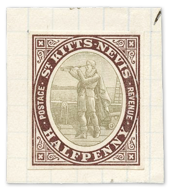
1903 stamp. Stanley Gibbons image.
This series of postal stamps was printed in London. It shows Christopher Columbus, who peers into the distance using a telescope. However, this device was invented only a hundred years later in Holland. The British Post explained that the stamp showed not a telescope, but a device without optics, which had been actively used since the 15th century. However, as seen in the image above, the tube has a folding mechanism that is typical for telescope tubes.
USA
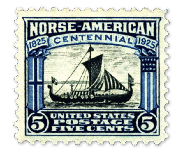
1925 stamp.
This stamp was issued in honor of the centenary of the arrival of the first settlers from Norway (1725). However, the stamp depicted a Viking ship to which the national flags of Norway and the USA were attached. This ship was launched in Christiania (Oslo) and sailed to Chicago in 1893. The travelers visited the World Exhibition dedicated to the 400th anniversary of the discovery of America by Columbus.
South Africa
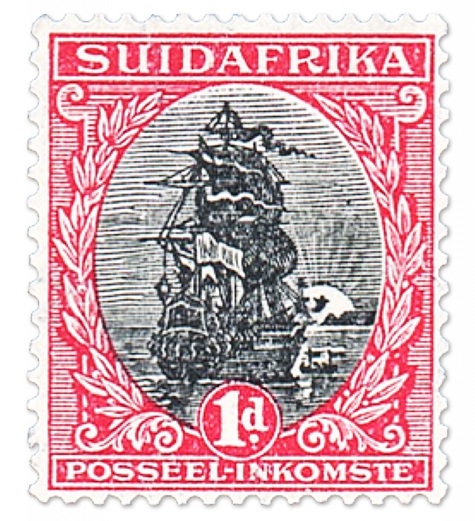
1926 stamp.
This stamp shows a wrong vessel. Instead of the ship on which Jan van Riebeeck first landed on the Cape of Good Hope in 1652, the Dutch military ship of later times was depicted. In addition, the sun should be on the opposite side of the summit of Table Mountain (it should not be visible on the stamp at all).
Cuba
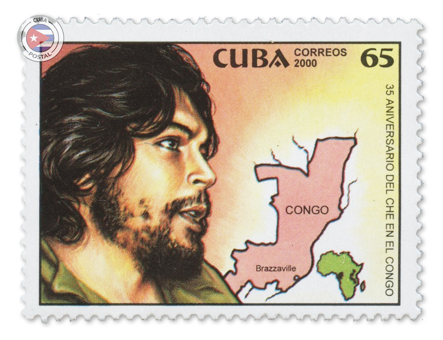
2000 stamp. Cuba Postal image.
This stamp should show the former DR Congo with its capital in Kinshasa. Instead, the piece shows the former French colony Middle Congo with its capital in Brazzaville (which Che Guevara had never visited).
Examples of Errors in the Depiction of Natural Phenomena
Czechoslovakia
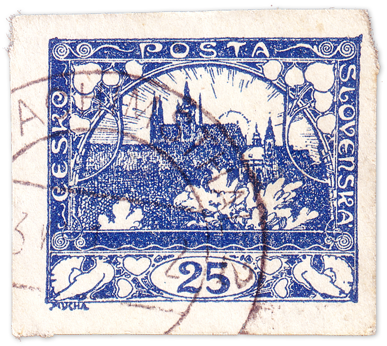
1918 stamp.
On this series of stamps, the author depicted Hradčany (Prague) and the bright sun behind it. However, the artist made a mistake when he painted the rising sun symbolizing the independence of the republic. The picture shows the northern view; therefore, the sun cannot rise there.
Philippines
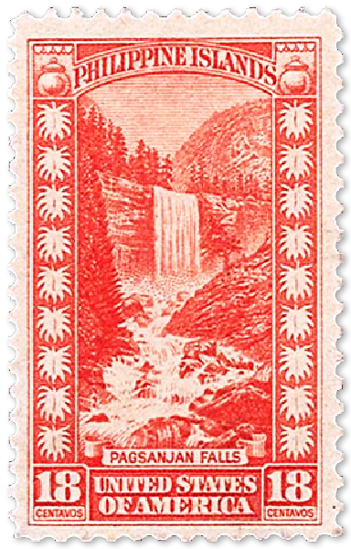
1932 stamp.
The United States has launched a series of stamps with a Filipino motif featuring the Pagsanjan Falls. However, instead of them, the artist depicted Vernal Falls, which is a landmark of Yosemite National Park in California. This design error has turned a regular stamp into a valuable one and nowadays collectors can get good money for it at stamp auctions.
Monaco

1947 stamp. William H. Gross Stamp Gallery
This postage stamp was issued in Monaco, and it shows US President Franklin Roosevelt. In his right hand, he holds a magnifying glass, with the help of which he examines some stamp. If you take a closer look, you will notice that the president’s hand has six fingers instead of five. It can be assumed that such a mistake occurred as a result of the play of light and shadow in the photograph, which the artist used as a prototype for the stamp.
Examples of Errors in the Depiction of Technological Processes
France
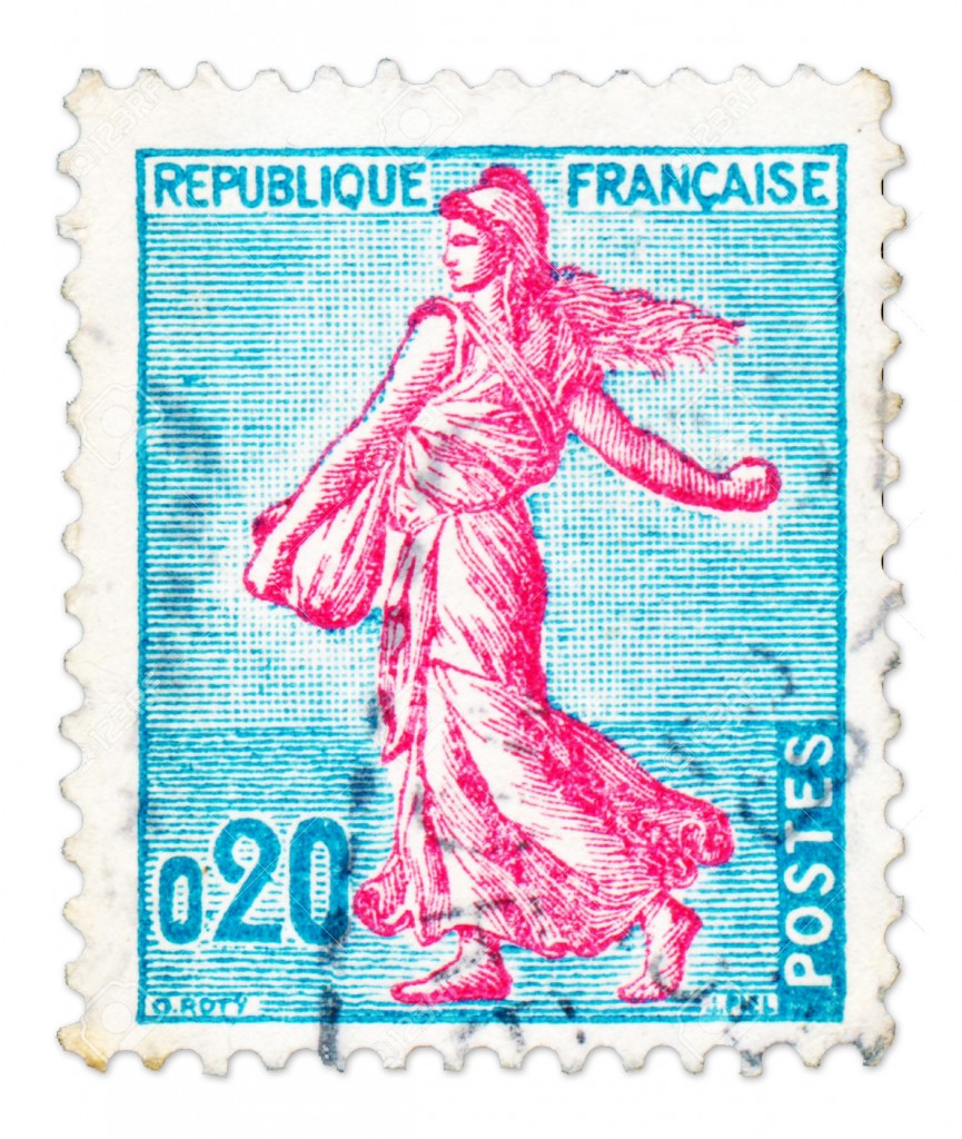
1960 stamp.
At first glance, this is a standard edition of the French stamp with the allegorical portrayal of a woman sowing grain seeds. This stamp has been printed for decades with the same mistake. If you look at the details, you will see that, judging by the clothes and hair of the woman, she is sowing against the wind, which is a wrong technique.
South Africa
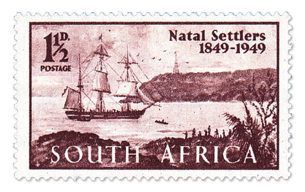
1949 stamp.
The stamp was issued to commemorate the centenary of the anniversary of the arrival of the first British settlers in Natal (who traveled in the brig). The stamp shows a ship with three masts, however, in fact, there should be only two of them. Moreover, the proportions allow assuming that the lighthouse should be at least 200 meters high.
Examples of Errors in the Ownership of Territories
Dominican Republic
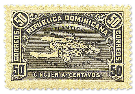
1900 stamp.
On the map depicted on the stamp, the border between the Dominican Republic and Haiti is to the west of the real one. The post office of the country was forced to withdraw these stamps from circulation due to the threat of military actions that might have followed. In 1929, the two countries issued stamps with a correct image of geographic boundaries.
People's Republic of China

1968 stamp.
This stamp shows workers with banners and slogans stating that the whole country is red. After it was released, it was discovered that the artist did not paint Taiwan with red color, where, as it turned out, the supporters of Kuomintang were hiding. The stamp was immediately withdrawn from circulation, and the entire issue was subject to destruction. One of the remaining unique stamps was sold for a huge amount of money ($474,800) at a philatelic auction.
Examples of Errors in Symbolism
USSR

1958 stamp.
This stamp shows flags of various states including the flag of Czechoslovakia. However, on it, the white stripe is at the bottom, and the red one is at the top while it should be the other way around. Interestingly, it is still not known which flag is drawn on the left, below the flag of Mongolia.
France
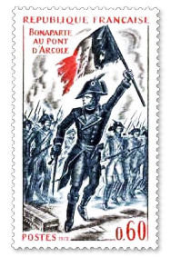
1972 stamp. Philatimbre image.
According to the plot of the stamp, General Bonaparte (commander of the French army) leads the military and occupies a bridge with the French flag in his hand. It is important that, in reality, he would have never carried this flag since he had to carry the battle flag of the infantry regiment.
Example of Error in Personality
Australia
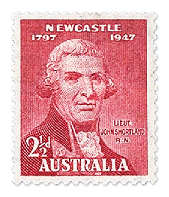
1947 stamp.
This is a series of stamps dedicated to the 150th anniversary of the founding of Newcastle. It was planned to portray the explorer Lt. John Shortland, who discovered the Hunter River. However, in reality, the artist drew the portrait of his father.
Example of a False Design Error
Newfoundland
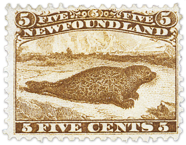
1865 stamp.
The stamp shows a seal which has not flippers but clawed paws. Until the 1920s, it was believed that the artist had made a mistake in depicting the animal, but it was found out that this seal species actually lives in Newfoundland. Therefore, it turned out that it was not a design error after all.